UNIQA
A healthy and fitness guide system for mobile devices.
M.Sc Team Project
Sofia Dima, Yujin Kim, Joshua Milton,
Mattia Navacchia, Shreya Surana

A healthy and fitness guide system for mobile devices.
M.Sc Team Project
Sofia Dima, Yujin Kim, Joshua Milton,
Mattia Navacchia, Shreya Surana
Design Healthy Lifestyle Guide System which guides both fitness guide and healthy food recipes for people from all ages and backgrounds.
The most obvious manner in which technology assists nutrition is through apps and Apple and Android stores are flooded with these. However, we noticed that in terms of the meal plan on these apps, most apps have the same basic features:
In terms of UX and UI design factors, we found out that a majority of current existing nutrition apps imply minimalism design. We believed that it would be related its users’ requirements.
Some products aim to maximize efficiency, whereas others try to create an exceptional user experience. The effectiveness of most of the fitness software underlies on the motivational mechanisms used. Since users have an immensely wide range of choice, they have high requirements for an intuitive interface, automatic tracking and security.
Understanding users effectively is one of the pillars for the realisation of a great experience. It is important to know who they are but moreover, it is essential to understand their motivations, behaviour and mentality.
Their use of technology heavily depends on their guardian. Parents are reluctant to entrust them with digital devices because they are worried about the consequences of this interaction.
For them, the most used object is some type of a digital device so this category of users is the most suitable for the idea of integrating a health system within their residence. They can transfer their knowledge to their parents to involve them in pursuing a better life style and this adds a component of bonding for the entire family.
They are trickier, as they are more likely to stick with older technology that they are comfortable with, but this age group also has the most disposable income to spend on new technology.
The definition of costs here, a user encounters when using a system. These costs have to be felt to be worthwhile for a user to persist with the system. The costs are described below:
The most evident cost in tracking their eating habits and fitness regimes is having to manually input meals or workouts.
When cooking, users need to enter ingredients of what they are making, but also quantities.
We have a variety of data from the tech-savvy early adopters to the elderly who may not own phones. Interestingly,
regardless of age, the majority have at most two hours to spend on food (making meals) and fitness combined and the
majority find the biggest constraint to be budget when deciding what to eat.
From our survey, in terms of daily hours of physical activity, a large proportion of responses spend less than two hours
for fitness (69.5% in total), with a third spending no more than an hour.
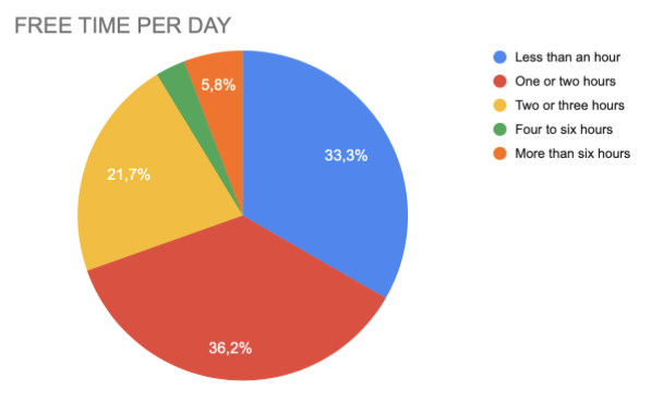
Free time per day
In addition, we discovered that the hours of training are linked to how many times a week people do medium or high-intensity workouts (those who do two hours/day of physical activity tend to work out at least four times a week).
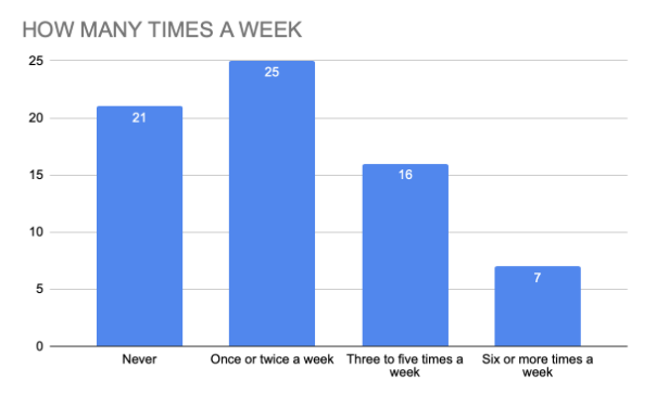
How many hours of physical exercise per week
Another relevant aspect is budget where Middle-age group tends to spend more on food and fitness compared to the other groups. 27.3% of people within that group spend more than £200 a month for food and fitness, whereas the proportion of the Young Adult group is only 20.4%.

Spending budget on food and fitness
We also conducted interview to find out extra themes. Our interviewees mentioned that time constraints seemed to be a main factor. Also, any prospective technological solution would need to be flexible, non-intrusive and undemanding of them.
The major two implications are that the software should be more focused towards diet than fitness and the second is that suggestions should be tailored on minimizing time and cost.
These would be useful when assessing the suitability of our design ideas, as it would give us a person to imagine using our system. We came up with three people: Damien, a 21 year old student; Nicole, a 42 year old working mother; and Emaad, a 75-year old retiree.
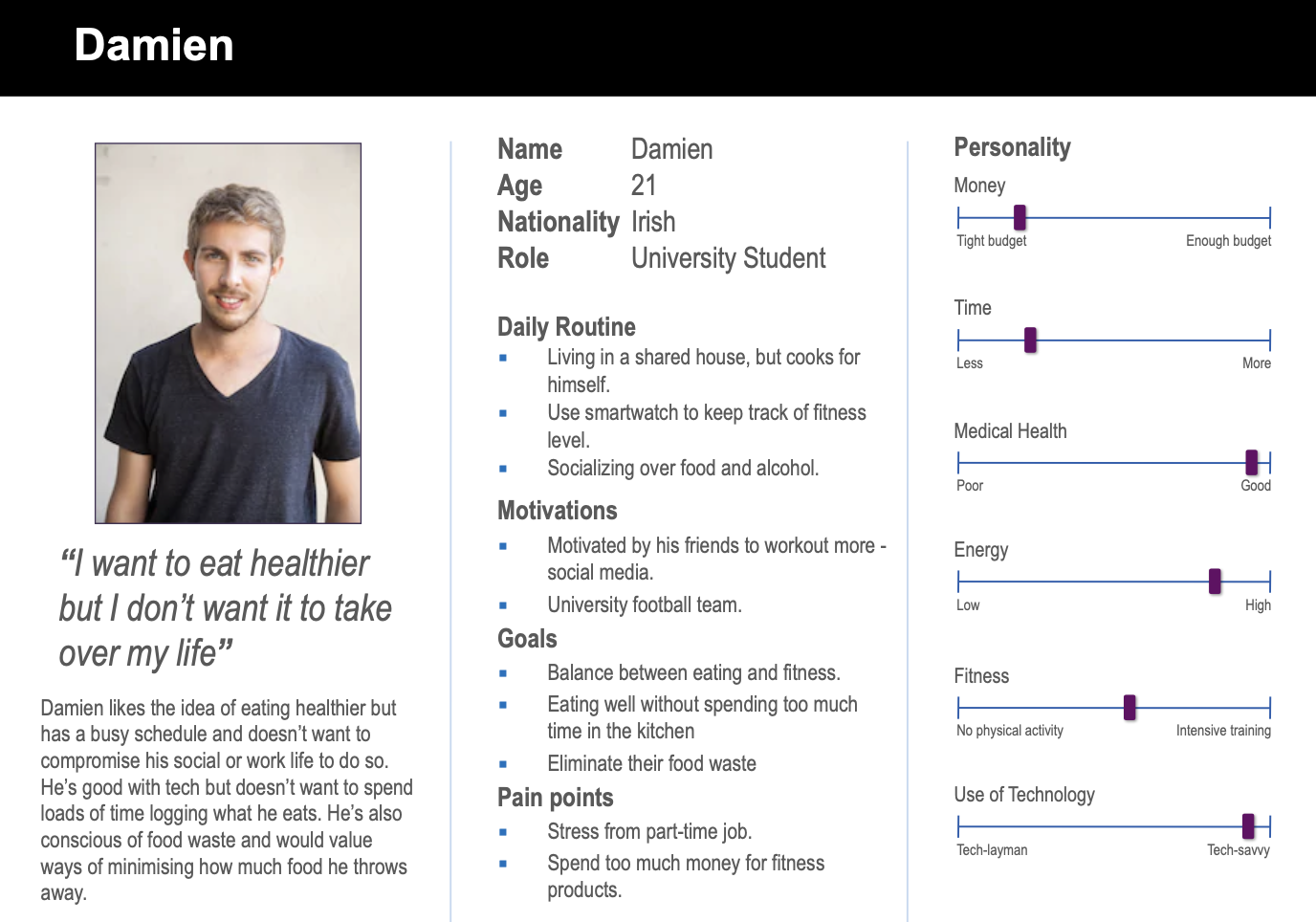
Young Adult
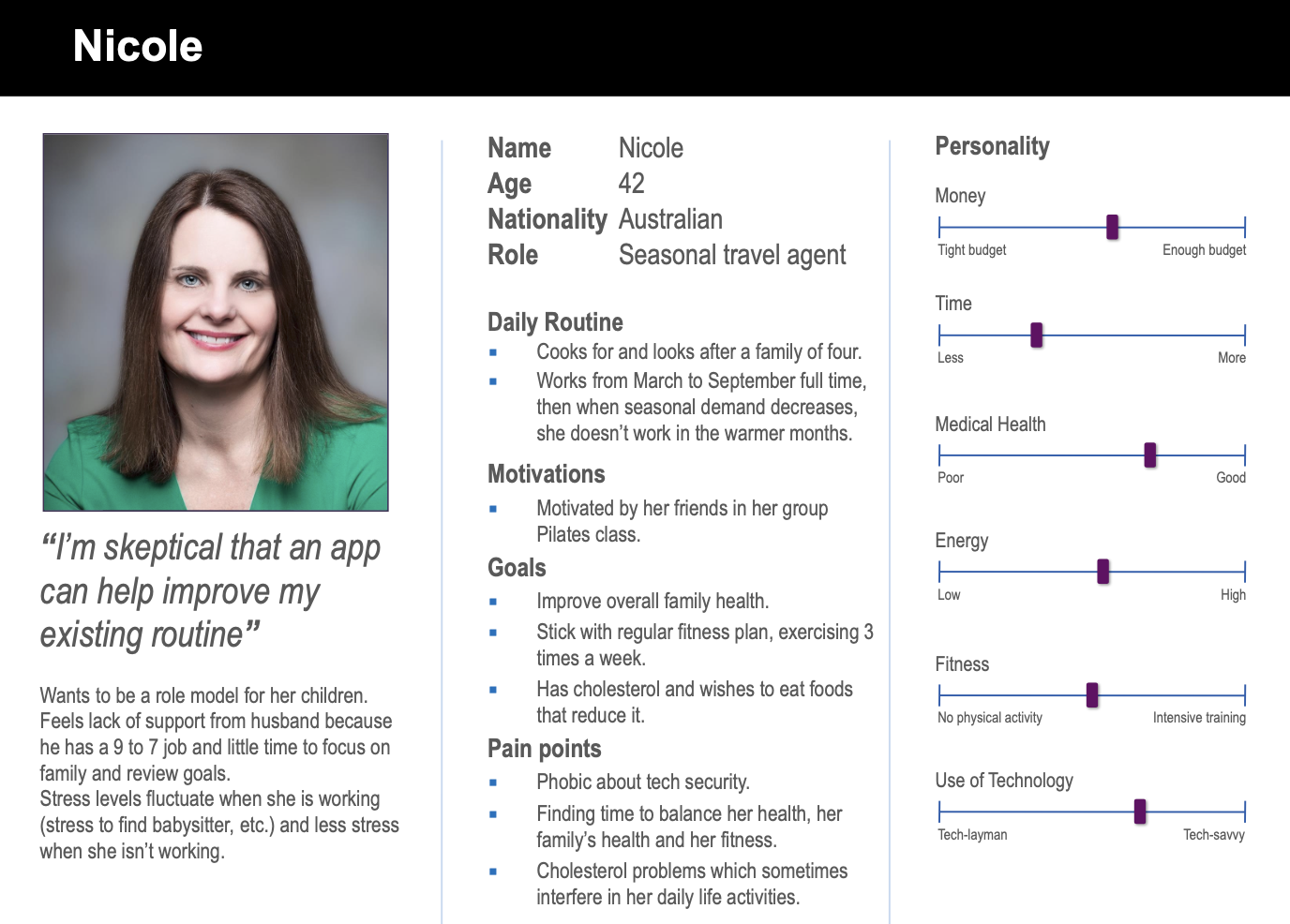
Middle Age
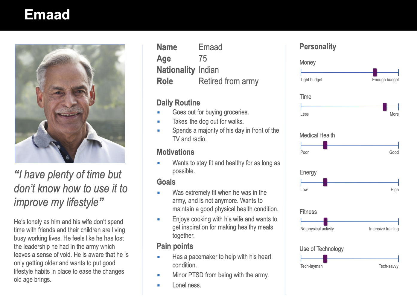
Elderly
To explore what form such a product could take, we designed numerous rough sketches.
This was an amalgamation of sketches which proposed a system for recommending meals, or fitness activities, based on the
time available. It has a streamlined interface, with screens initially offering options to narrow down what the user
wishes to do – eat or exercise, cardio or strength, hot or cold meal, vegetarian or not, and most crucially the amount
of time they have available to them.
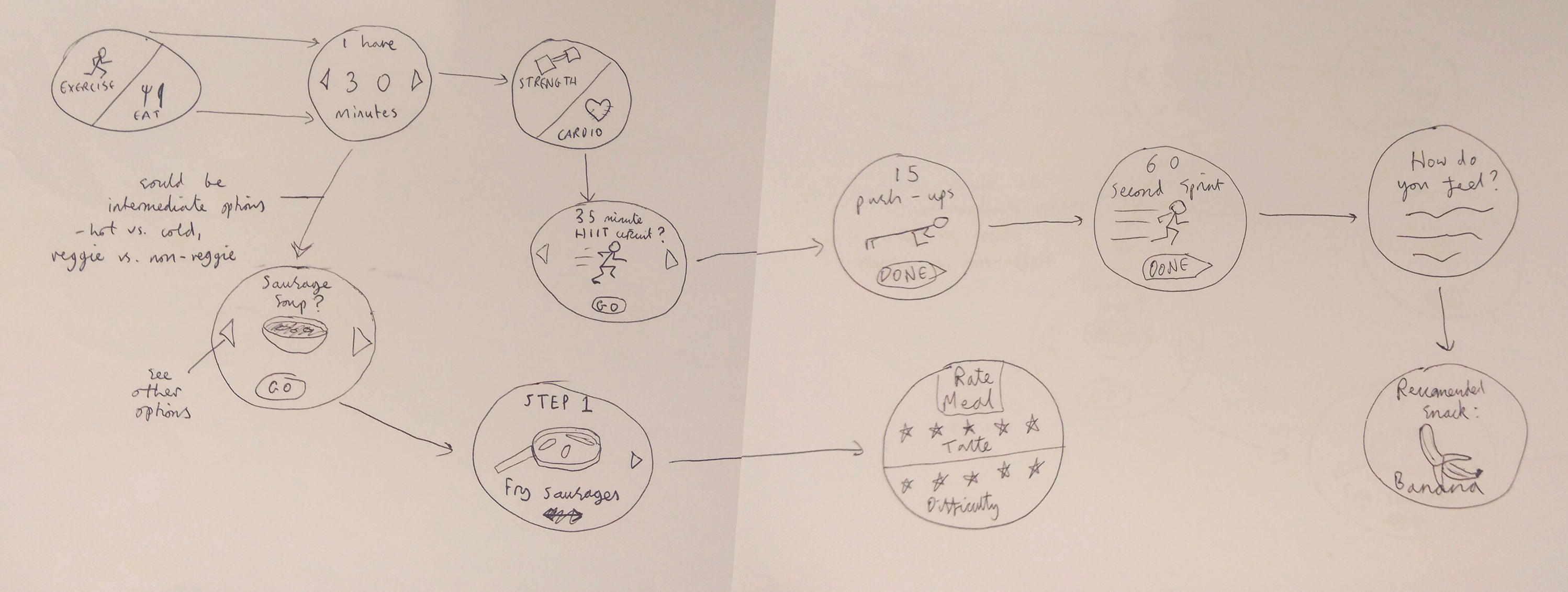
A smartwatch to give on-the-go food or fitness suggestions
Even though the sketches are rough-looking and contain various limitations due to the lack of details of a low-fidelity prototype, we decided to evaluate them using actual potential users. First, we guided the users to understand the project giving them useful information on the possible ways in which they could interact with the Lo-Fi sketches. A brief introduction was helpful for giving context to what the users were looking at. Then, we asked a few questions:
We created many different ‘screens’ to show the extent of our smartwatch app, though a real implementation of the product would include many more options for meals and activities, and potentially more intermediate options in the choice of ‘strength vs. cardio.’
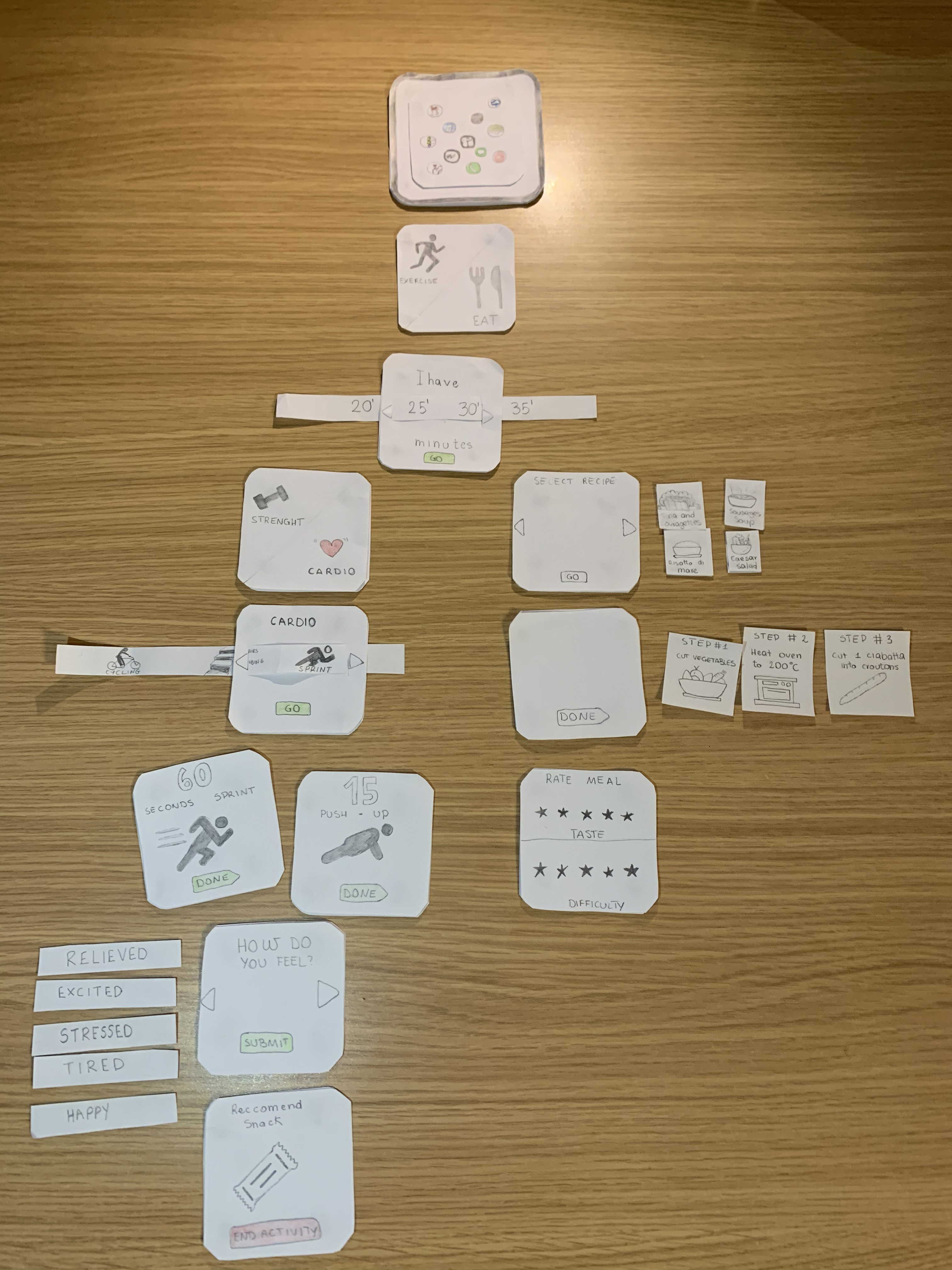
Paper Prototpe
.gif)
It is interesting to note here that the ‘user’ tried tapping the icons associated with each step of the food prep process before pressing ‘next’, suggesting this element of the user interface was unclear. Also, we noticed that they were unsure how to interact with the final ‘rate your meal’ screen, suggesting the two rows of stars could be better designed. Perhaps they could be left unfilled out initially, and then the number of stars that they rate gets coloured in. In addition, in an initial trial the ‘user’ misunderstood the time selection screen, and tried sliding the paper along by dragging their finger along it, rather than tapping the left and right arrows.
.gif)
This test generally went well, though it took the user 20 seconds to complete the ‘how do you feel’ screens. This is meant to be a quick function at the end of an exercise, so maybe a quicker implementation other than a looped list should be implemented.
We designed an Hi-Fi version suitable for dashboards following the design and thought process that brought us to create
Lo-Fi sketches in the previous stage.
The user has to select the amount of time available for complete an activity that has to be chosen later and then follow
the instructions (steps) displayed. At the end, each of the macro area ends with different frames in order to acquire as
much information as possible from the user. This information are used for:
Keep track of particularly low or high days to perhaps see the correlation between meals the user has had that day compared to how good performance was of a physical activity.
Discard certain recipes and suggest better ones so the system can easily fulfil user’s desires.
As can be seen above and explained above, using the prototype, the user can choose between two possible options of interaction, Exercise and Eat.
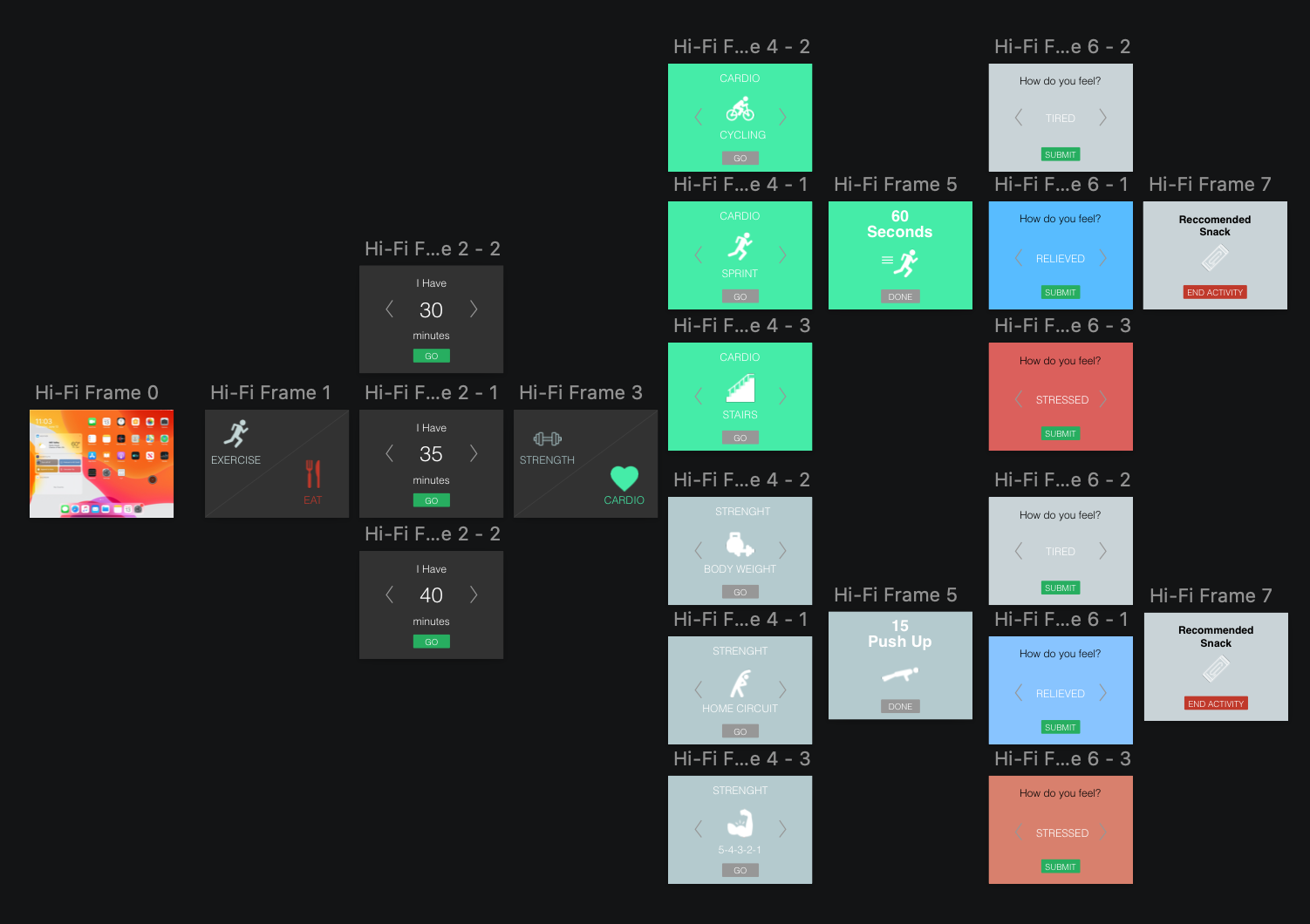
Final Hi-Fi Prototype of the Fitness part
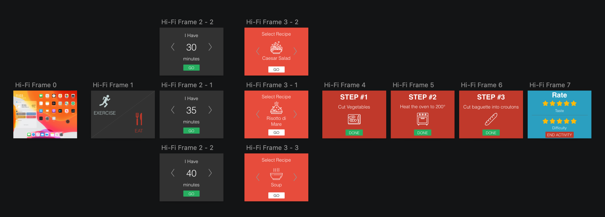
Final Hi-Fi Prototype of the Health part
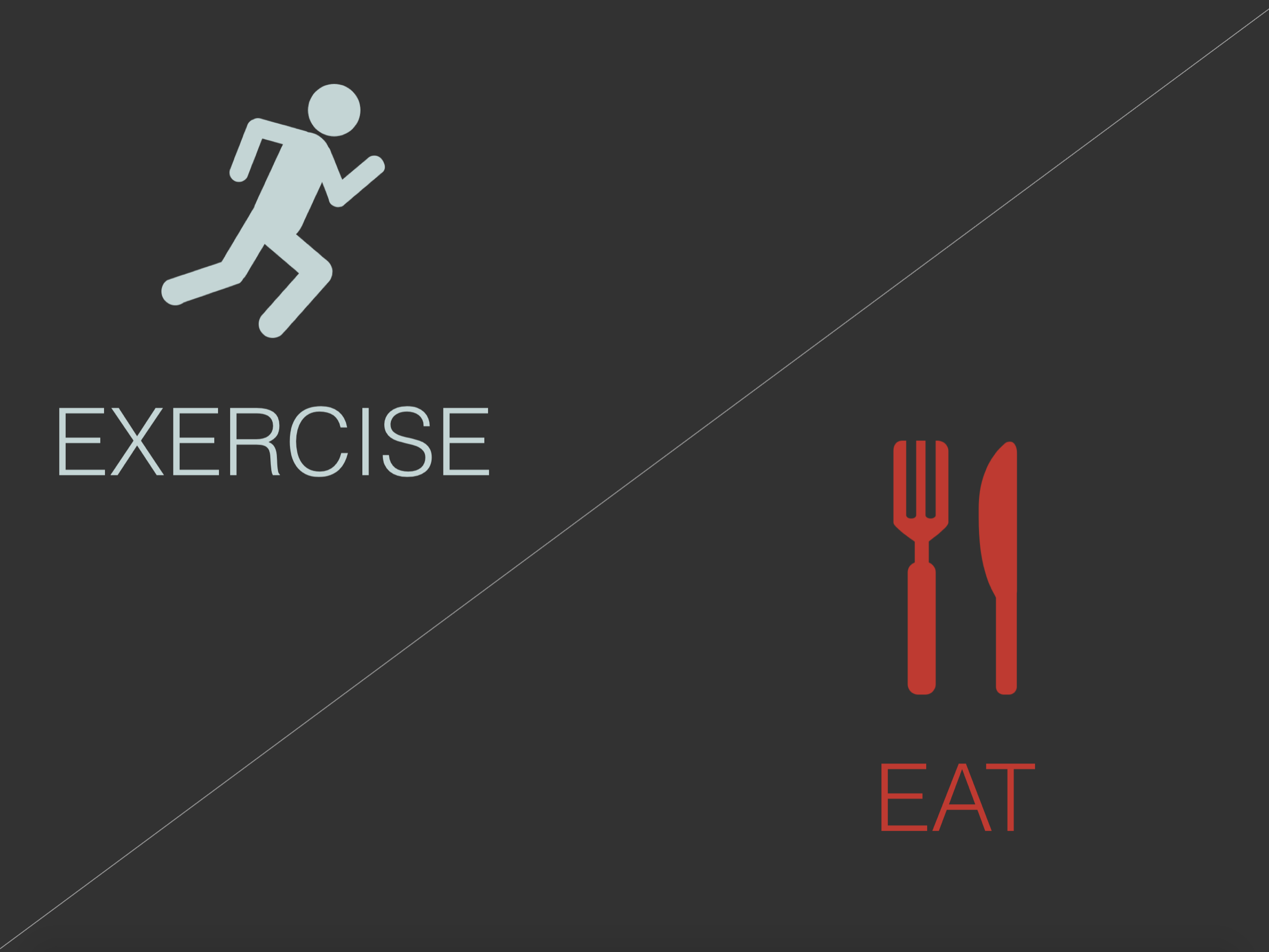
First frame for Hi-Fi Prototype
There are two possible interactions with this frame. The user can choose which type of Fitness activity to perform between Exercise (Fitness) or Eat (Food).
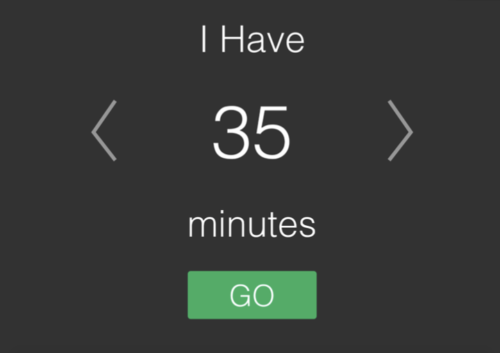
Timer
Touching the arrow icons, the user can select how much available time he/she has to complete the activity that will be selected in the next steps. Pressing the ‘Go’ button the system displays the next frame to display the meals that can be prepared or the fitness activities that can be performed within that duration.
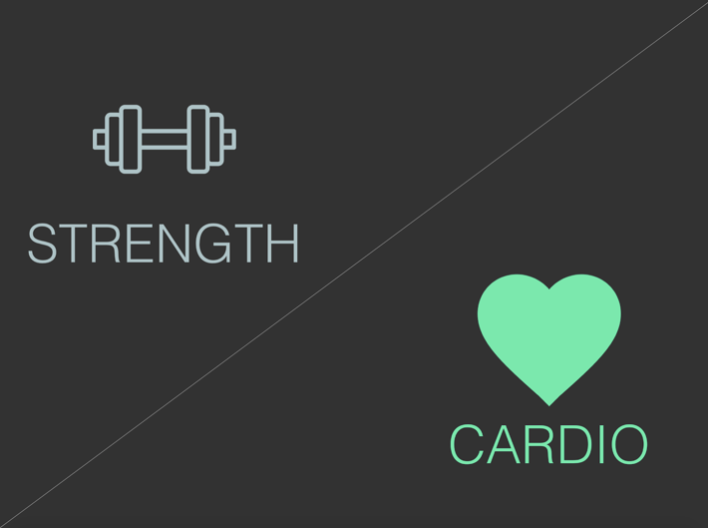
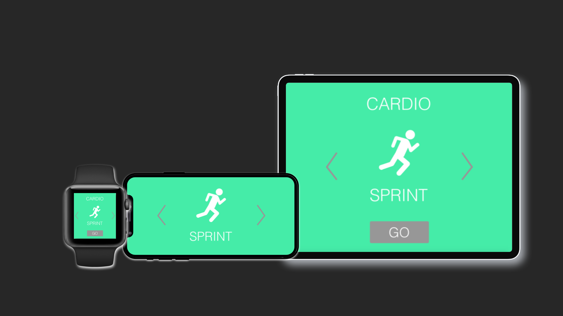
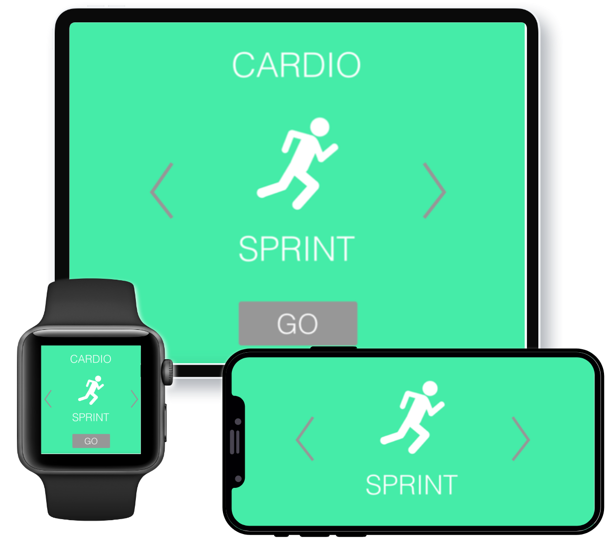
Cardio/Strength
There are two possible interactions with this frame. The user can choose which type of Fitness activity to perform between Strength and Cardio.
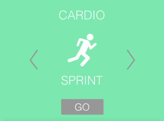
Cardio
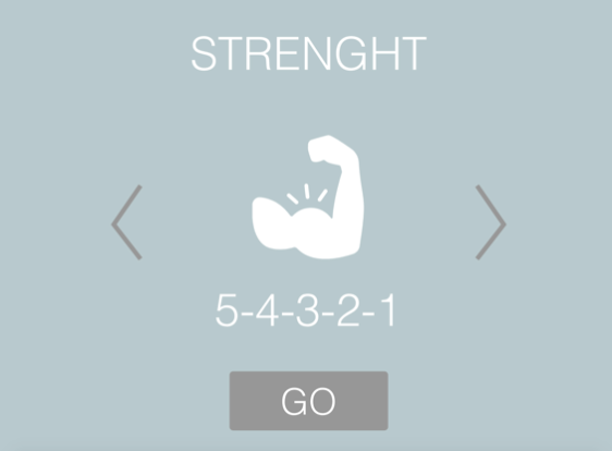
Strength
Based on the previous choice, the user is directed to one of the above frames. Touching the arrow icons, the user can select the desired type of Fitness activity. Pressing the ‘Go’ button the system displays the next frame and considers the shown activity as the selected one in order to display all the necessary steps in the next frame. The activity is displayed using a characteristic icon and a name.
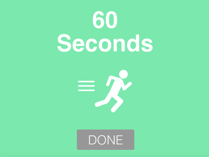
Sprint
In this case, we have chosen Cardio as our activity, so this frame displays all the steps the user has to follow in order to complete the training session. In this screenshot, we see the exercise ‘60 Seconds Sprint’. The frame also shows the countdown about the time or the number of repetitions left. Pressing the ‘Go’ button the user can mark that step as done and move forward.
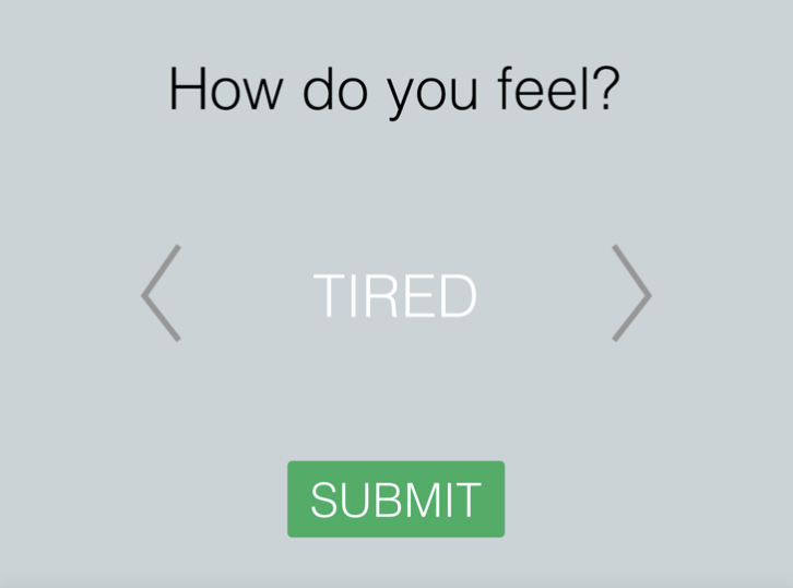
Feeling
Here the user, pressing on the arrow icons, can select the best description of his/her current feelings. Each emotion has a different background colour, corresponding to the emotion. Pressing the ‘Submit’ button allows the felt emotion to be stored and recorded. This is used to better understand the user’s opinions about the just finished activity, but also keep track of particularly low or high days to perhaps see the correlation between meals the user has had that day compared to how good performance was of a physical activity. Or perhaps whether the user performs better earlier in the day or later (on a filled stomach). This will permit the system to better make suggestions in the future.
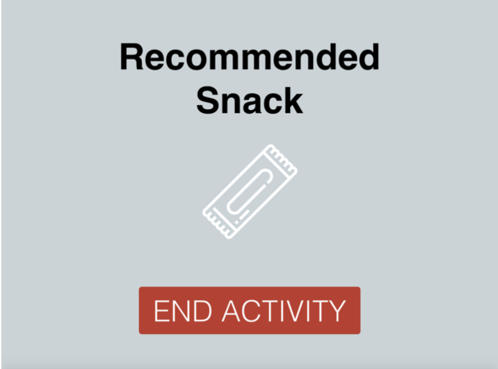
Snack Recommendation
This last frame suggests a recommended snack that the user could eat based on their exercise. The ‘End Activity’ button simply ends the activity.
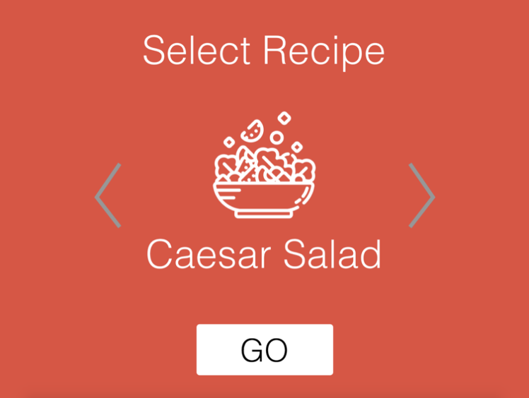
Recipe Select
Here the user can press on the arrow icons to select a recipe with a preparation time that stays within the amount of time previously selected. Pressing the ‘Go’ button the system displays the next frame to display all the necessary steps.
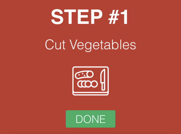
Recipe
In this case, we have selected Caesar Salad as the meal we would like to have. Then the following set of frames display all the steps the user has to follow in order to prepare the dish. In this screenshot it can be seen a ‘Step #1 - Cut Vegetables’. Pressing the ‘Go’ button means the user can mark that step as done and move forward.
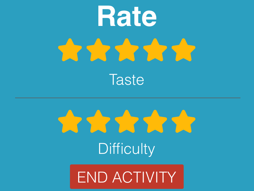
Rate taste/difficulty
Before ending the activity, the user can rate the recipe on two different aspects, taste and difficulty. The ‘End Activity’ button simply ends the activity.